Quilt Templates Packaging For Carolyn Forster
Quilt Templates Packaging


Carolyn Forster is a well-known patchwork quilter with a large following around the world. We have worked together for over 10 years, since I designed a her blog. Carolyn asked me to create a new branding design for her packaging of plastic templates used as guides to cut out the fabric.
The starting point for the packaging was the size of the largest template. I wanted to create a unique pack design that we could use for all of Carolyn’s templates. Carolyn found the printers – Generation Press – that could not only manufacture the packs, and could also add the characteristic string closures used in sewing patterns.
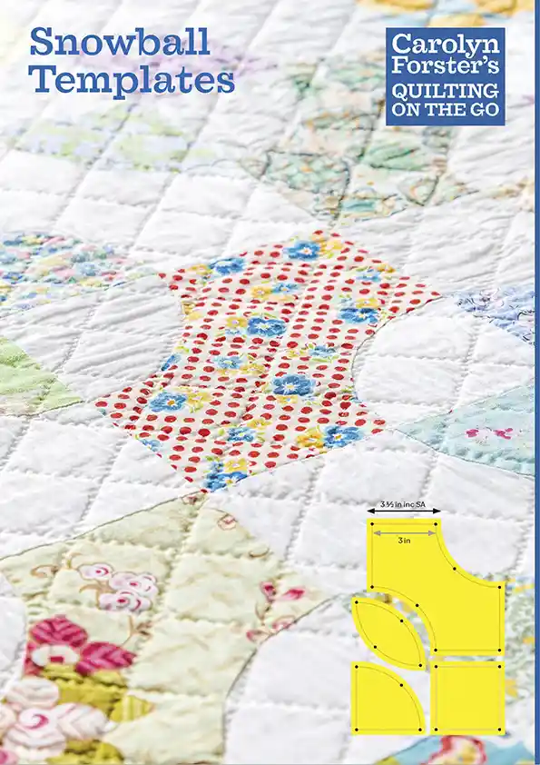
My design for the pack used a close up shot on the front and a more practical straight-on shot on the back, along with all the practical information…
- For the front of the pack I shot the quilt from low down with a shallow depth of field, concentrating on the distinctive snowball shape.
- For the back of the pack, I hung the quilt from the ceiling adding weights to make it hang evenly, I also tied the sides too to make it as perfectly flat. If had lit the quilt with a light on each side I would have lost all of the detail. So I shot it with one light on the left and a reflector on the right. I then used Adobe Lightroom gradient filter to lighten the right hand side to appear as bright as the left.
Carolyn drew rough diagrams for the information to add to the back. I recreated each of the diagrams in Adobe Illustrator using fine white key lines and fills in shades of grey. Then showed each of the yellow templates being used. Each of the diagrams has a distinctive diagonal pattern, matching the layout of the templates.
I created Carolyn’s new logo using the font Farao. I like how the descender of the Y fills in the gap between the T and the apostrophe. Quilting On The Go is all capitals to make it simple, like a sub heading. The logo is coloured blue and used large on the front of the pack, then repeated smaller on the back. To make the pack more distinctive I used the same blue colour for the gussets down each side of the pack. We liked the subtlety that a customer would only notice when picking up the packaging.
Carolyn is planning to sell the templates on her website and Etsy later in the year.
As part of the branding I have updated Carolyn’s website too. I have removed the previous all-over background pattern and replaced it with a cleaner white.