Dawes Jewellery Graphic Designs


Curvaceous Organic Designs
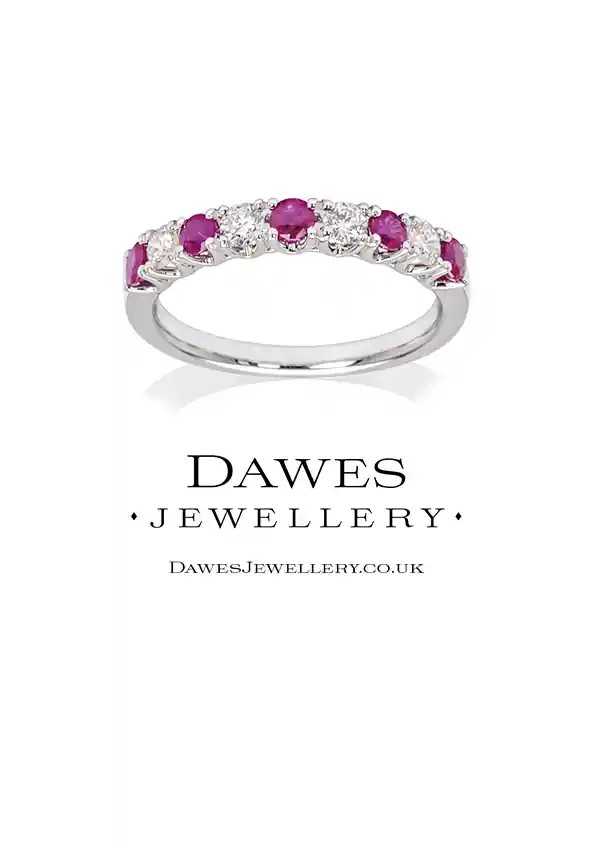
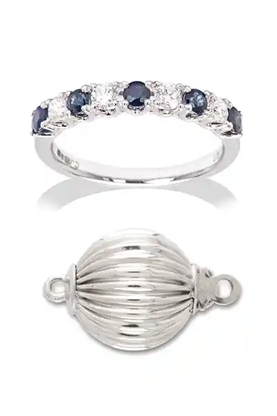
As part of the brand identity graphic designs for Dawes Jewellery I worked on ways to combine the logo I had designed, with my jewellery photography. My original design – shown first – uses the curving jewellery in a more organic form punctuated with the staccato of individual earrings along the right hand side. At the time the owner James Dawes felt this was too busy. The next designs I presented were much simpler with individual items above the logo.
Designed for Newsletters
The design chosen to be used as the first MailChimp newsletter that new clients will see has a neatly arranged grid of photographs showing a cross section jewellery – shown last.
Designs for Cards and Postcards
The simpler one-off designs have been printed as calling cards and postcards. They have also been used as single category targeted MailChimp newsletters for rings, lockets etc.
See more photographs for Dawes Jewellery.
See website designs for Dawes Jewellery.
Visit the Dawes Jewellery website.